DOTDOTDOT is an editorial magazine celebrating the bravery and creativity of artists. It explores how creatives across different disciplines overcome creative blocks and express their individuality, providing inspiration and insight into the artistic process.
THE CONCEPT
The magazine serves as a platform for artists of all levels to share their stories, values, and creative processes. DOTDOTDOT celebrates creativity and exploration through a range of media, from dance to art restoration, delving into how different creatives think, work, and overcome moments of creative block.
The publication encourages playful experimentation, offering activities and prompts to help readers spark their own creativity. The aesthetic balances a rough, experimental, and grungy tone with playful colours, textures, and layouts, reflecting the imperfections and individuality inherent in artistic practice.
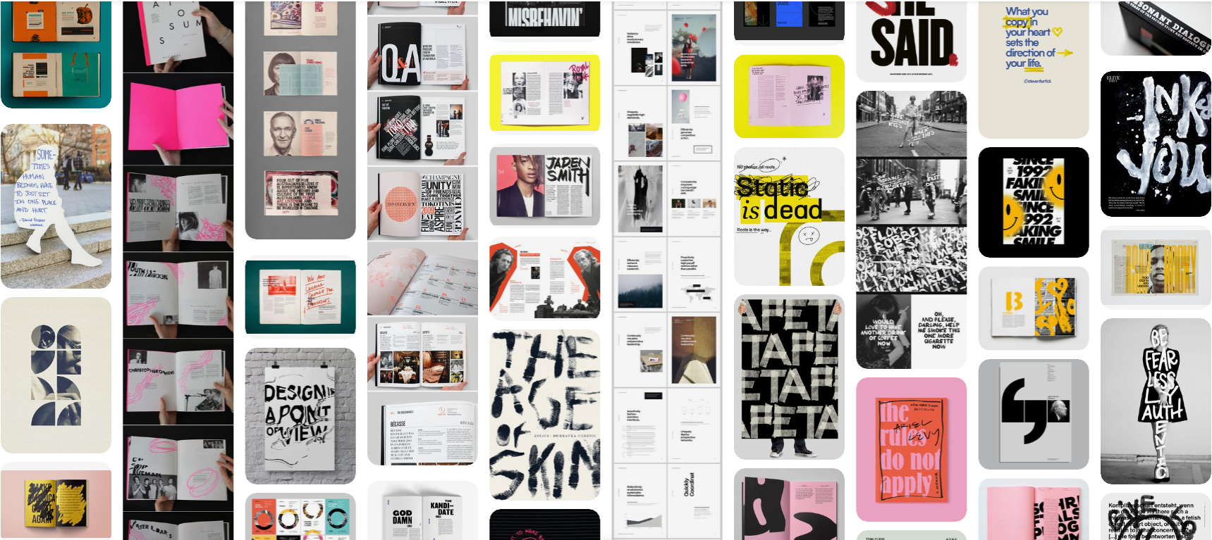
MOODBOARD
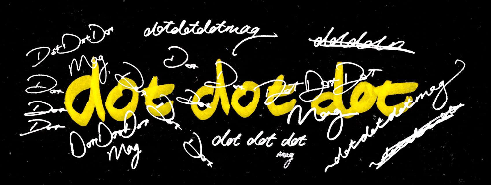
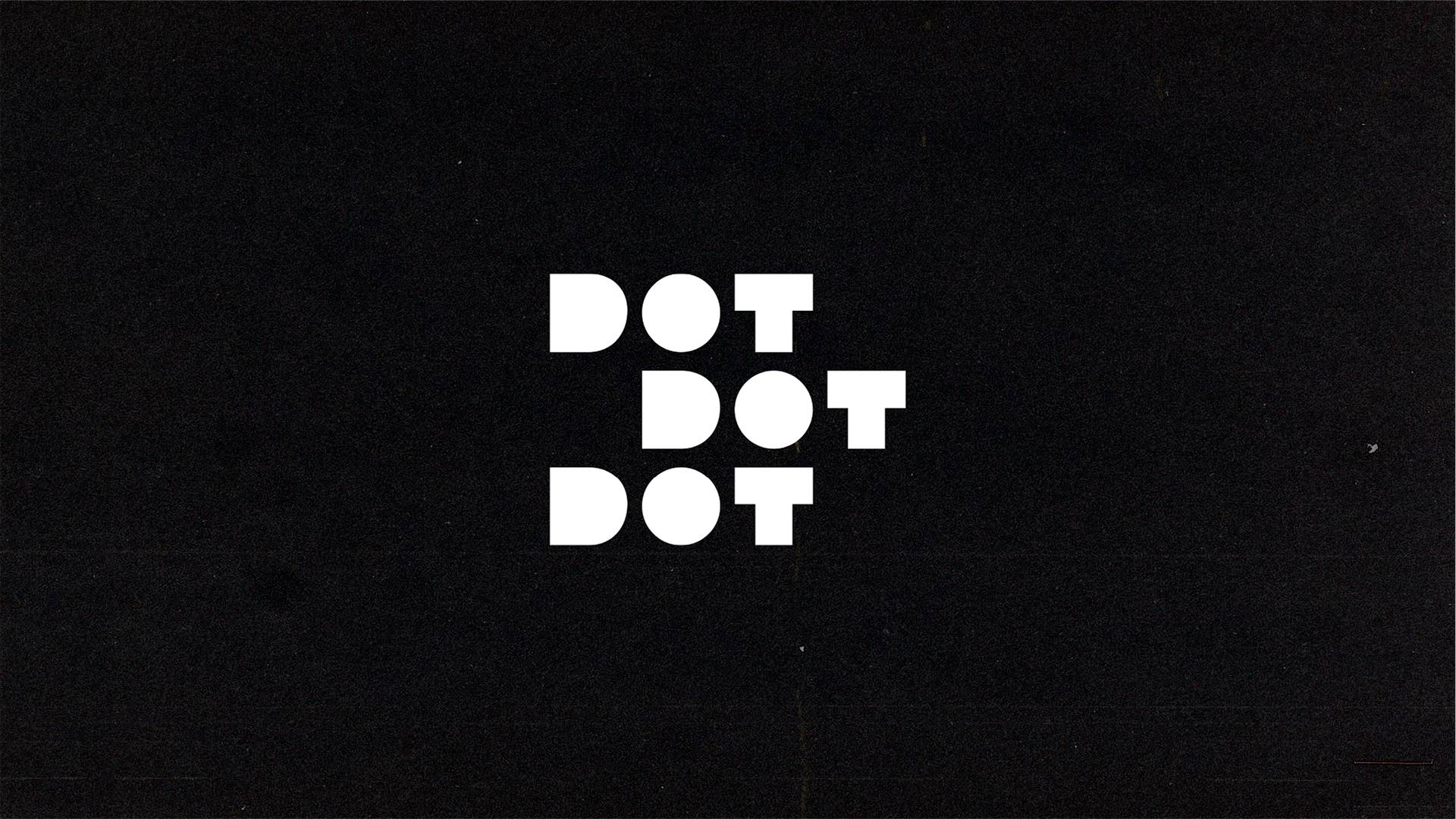
LOGO
The design process for "dotdotdot" was driven by our mission to truly capture the essence of each artist's journey. We aimed to emphasize the richness that emerges when these diverse voices and their artistic visions come together.
As we delved into the design process, we recognized and celebrated the inherent diversity among artists and the multitude of ways their creativity manifests. Each artist's journey is unique, reflecting their own perspectives and quirks.
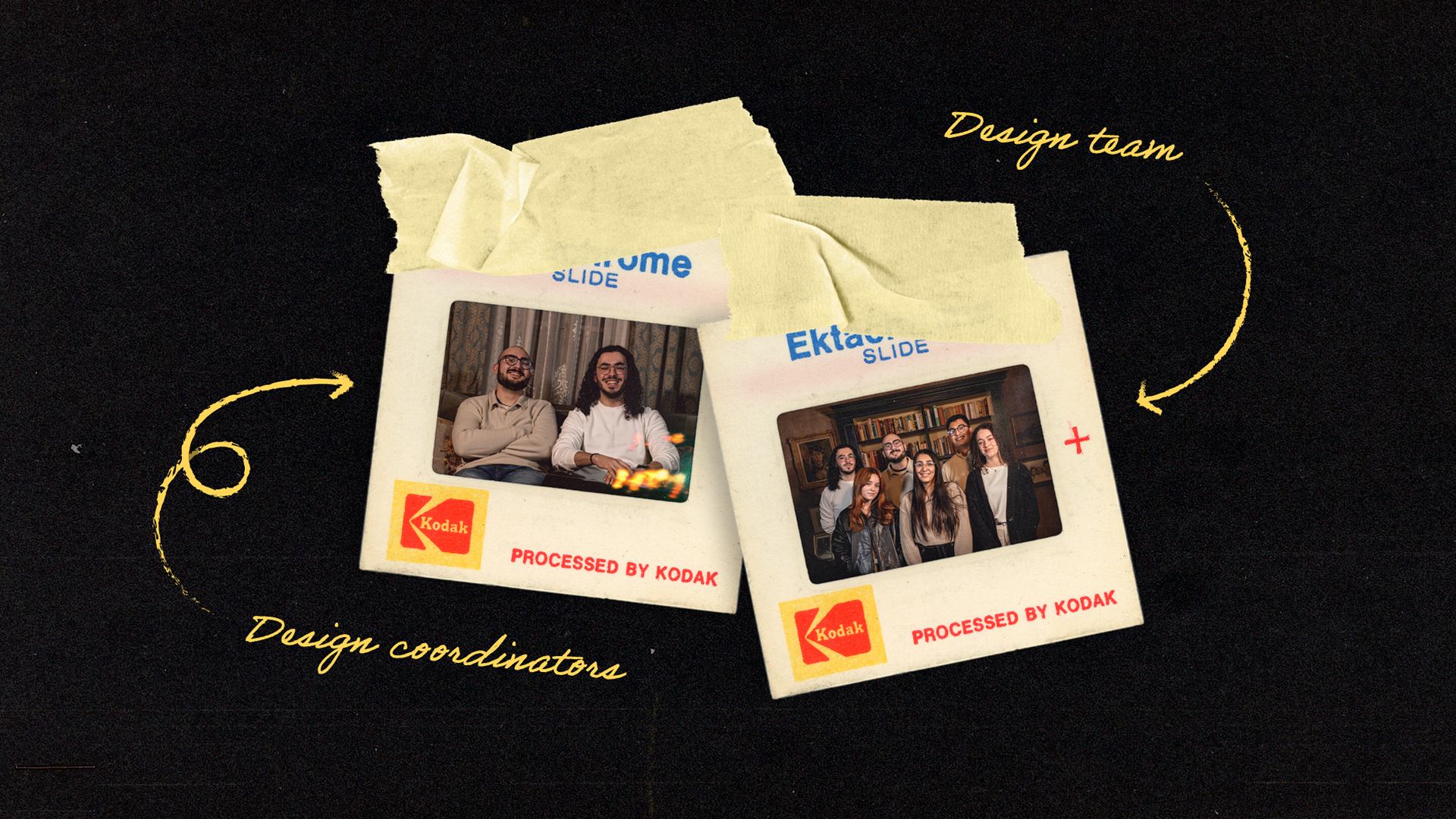
THE TEAM
As Design Coordinator, I led the magazine’s visual identity and overall aesthetic, developing the logo and guiding all visual touchpoints created by the six-person design team within the larger group of 28 students. I oversaw both digital and print outputs, ensuring consistency across the publication and a polished final look that reflected the magazine’s creative ethos.
FINISHED PRODUCT
The magazine’s design relies heavily on hand-drawn elements that were scanned and integrated into layouts, giving the publication a unique, tactile quality. The exterior cover is stark black with a spot-varnished logo, contrasting with a vibrant, colourful interior full of textures and playful layouts. This design system reflects the concept of creativity breaking through constraint. Despite tight deadlines, cross-team coordination, and print budget limitations, the team successfully produced a cohesive and visually engaging magazine that balanced experimentation with readability.
HAVE A FLIP THROUGH
DOTDOTDOT was printed and distributed for free across the university campus. It received praise for its distinctive visual style and still continues to inspire students years later.